12
4.2.3.
Creating and interpreting graphs
A data table allows us to relate and compare the variables we are investigating.
Scientists create graphs with the data in the tables to help them
interpret their
results
.
A
graph
uses lines or drawings to represent numerical data. Graphs allow us to
see the relationship between the variables we are investigating.
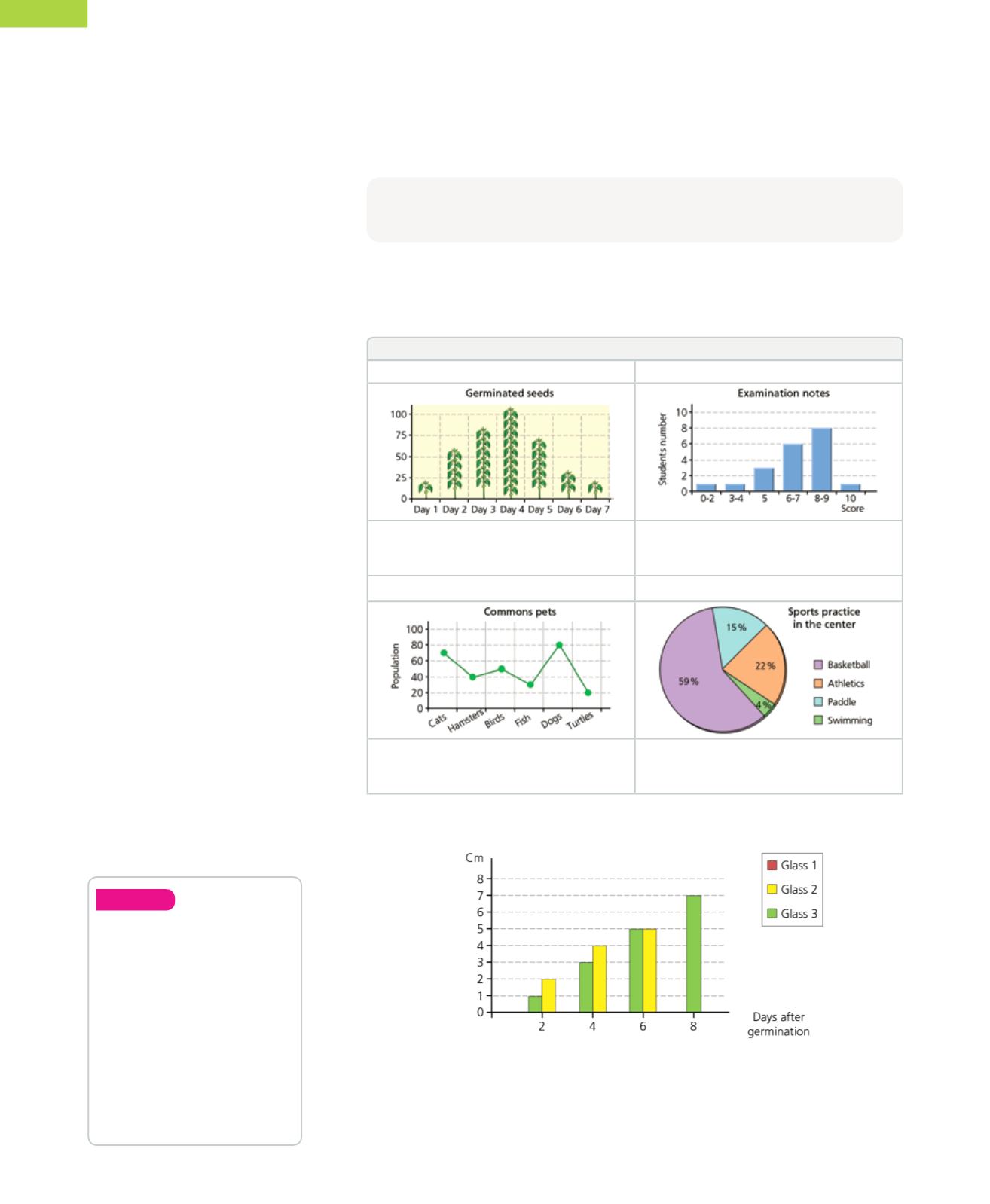
Types of graphs
Pictogram
Histogram/Bar chart
The data is represented by drawings related
to the topic. The drawings are different
sizes, depending on the value of the data.
The values are represented by bars of
different heights.
Frequency polygon
Pie chart
The data is plotted on the graph and the
points are joined with lines. This graph is
good for grouping data.
A circle is divided proportionally according
to the data.
Graphs
consist of two axes. The
x axis
(horizontal) shows the data controlled by
the investigator, such as the days when we measure the plant; the
y axis
(vertical)
shows the data obtained during the experiment, such as the height of the plant.
We can use the information in our data table to make this graph.
Create
10.
Create a table, a bar chart
and pie chart with the
following information.
79% of all the fresh
water in the planet is
found in glaciers, 20% in
subterranean waters and
the remaining 1% are
the rivers, lakes and other
surface fresh water found
on the continents.
This graph shows that the seed in
glass 1
didn’t germinate. We can deduce from this
that beans need water to germinate. In
glass 2
, growth was slow but constant. In
glass 3
, the bean germinates and grows well in the beginning, but then the plant
dies. We can deduce from this that excessive water is as bad for the plant as no
water.


